
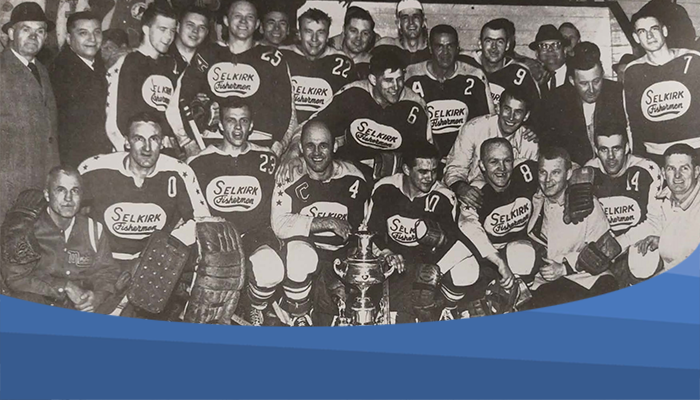
Canada’s longest-running junior hockey team, the Selkirk Fishermen has been making history since 1917, shaping generations of athletes and delivering unforgettable nights at the rink. While players and eras have come and gone, one thing has continually evolved alongside the team: its identity. Over the years, the Fishermen have worn seven distinctly different logos (with a handful of variations), most proudly displayed on the front of their jerseys, with select seasons introducing alternative designs.
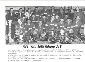
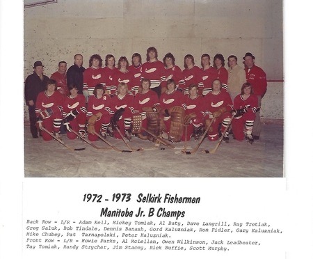
1917 to 1973
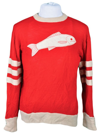
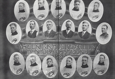
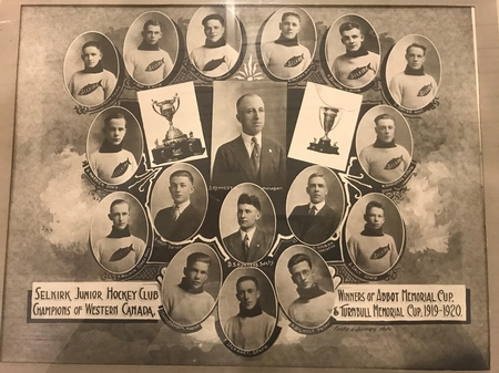
The Fishermen’s first logo was a simple white fish, which they kept for 56 years. Certain versions of the logo included the white fish in an oval, with “SELKIRK” written over top. Over the years, the fish varied slightly by changing directions or having a different tail.
1973 to 1975
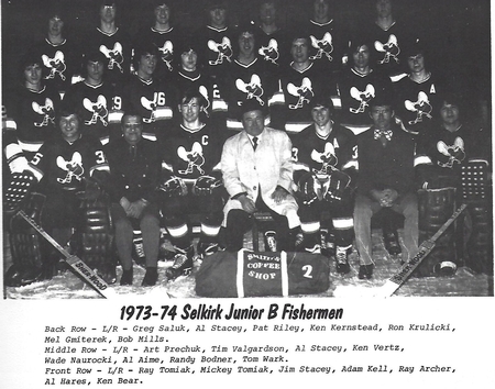
Next up is the first use of a hockey player in their logo. This logo depicts what appears to be a hockey player getting ready to shoot a puck.
1976 to 1978
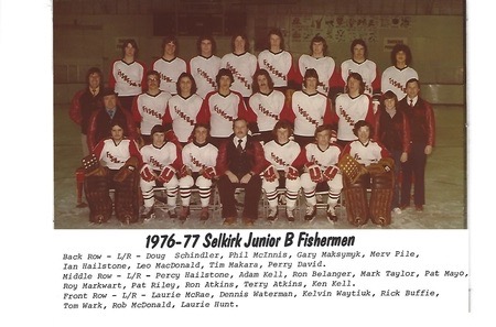
Logo unknown, but an honourable mention to the Fishermen’s jersey design which they used for manyseasons. The word, “Fishermen” appeared in a downward diagonal either in red or black.
1978-1989
In 1979, a reimagined version of their previous hockey player logo came to be. This athlete was more upright, but was still preparing to shoot the puck.
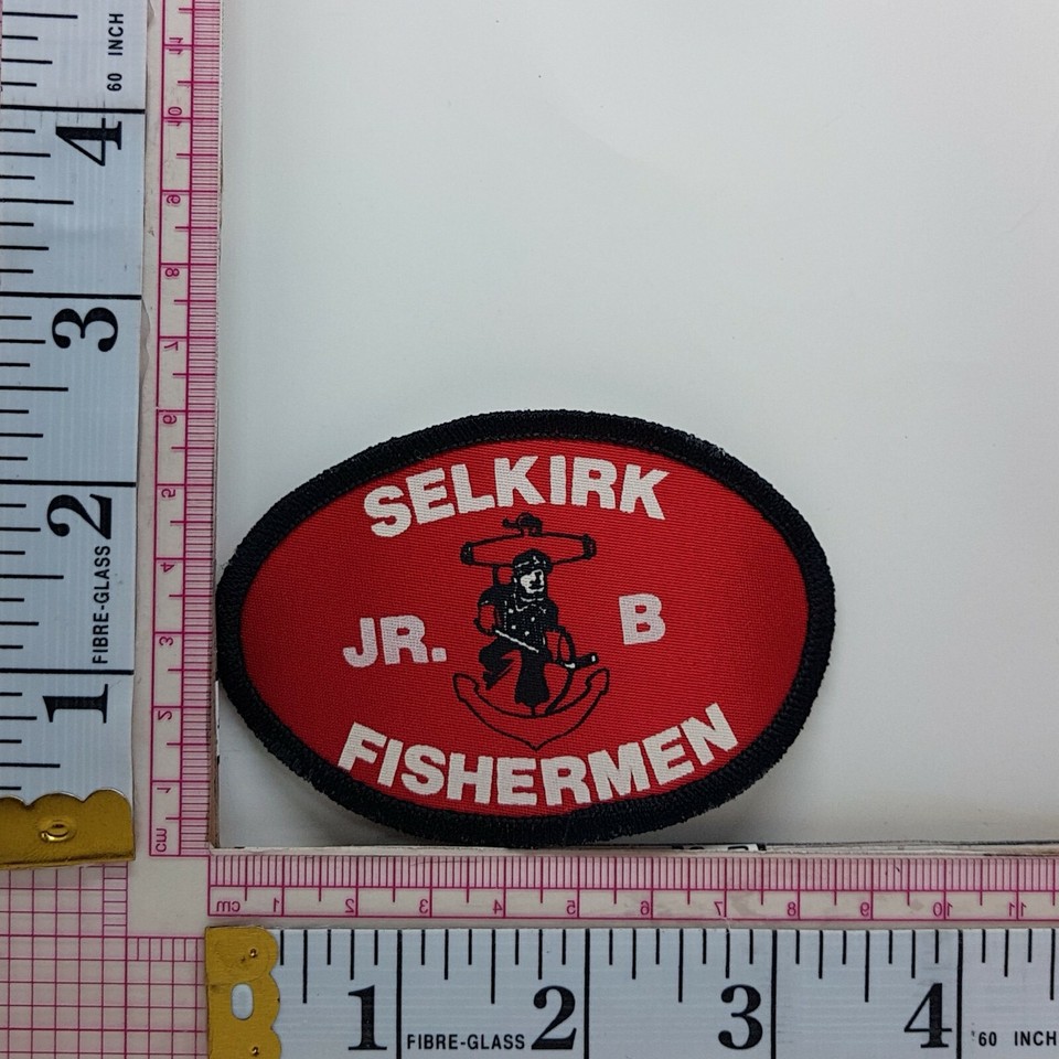
1989-2000
Jumping on the “swoosh-underline” logo trend, throughout the final decade of the 20th century, the word “Fishermen” with a red swoosh could be seen and attributed to the Selkirk Fishermen.
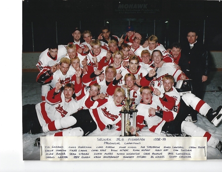
2001-2017
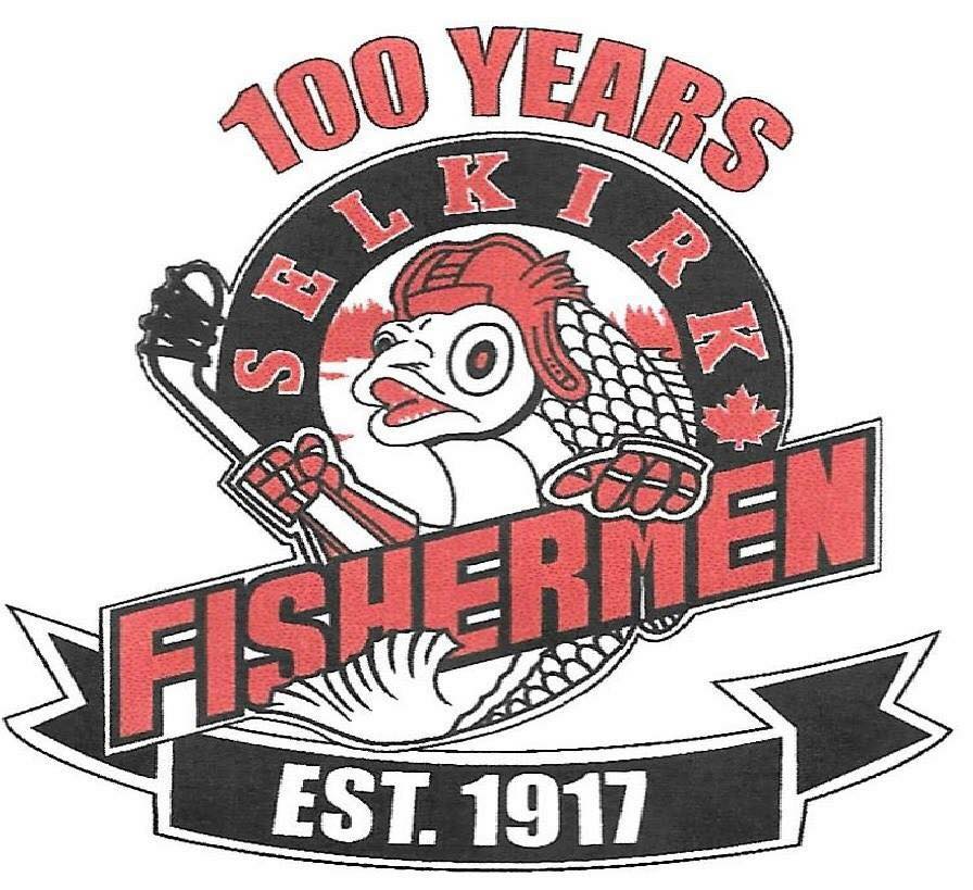
At the turn of the century, the Fishermen logo returned to its roots and a new fish appeared. This fish can be described as more friendly and cartoon like compared to its heirs. It is a catfish portrayed with a red helmet and gloves while holding a hockey stick. The words, “Selkirk” and “Fishermen” also appear in the logo.
Two seasons, 2013/2014 and 2009/10, used the word “Fish” as the featured image on the front of their jerseys.

In 2017, they had a specially designed jersey debut for the 100th anniversary. A red, “F” could be seen on the front.
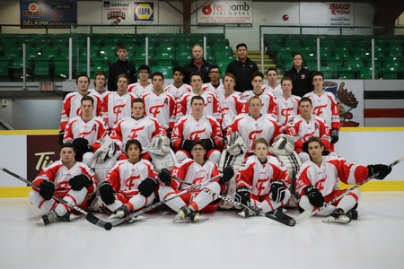
2018-Present
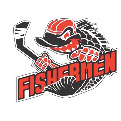
For the last eight years, another catfish has become the face of the Fishermen. Still donning its hockey gear, their current logo definitely has a more competitive and aggressive feel to it.
Sources
100+ Years of Team Photo’s, Selkirk Jr. B Fishermen
1919/20 Selkirk Fishermen, Manitoba Hockey Hall of Fame
Selkirk Journal, 2017, 2000